∞ one ∞
P1000171
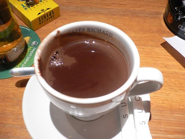
MapThe best chocolat chaud in Paris. At the corner of Rue Archives and, uh, whatever that street by the little park is.
Use left/right arrow keys to navigate through photos

The best chocolat chaud in Paris. At the corner of Rue Archives and, uh, whatever that street by the little park is.
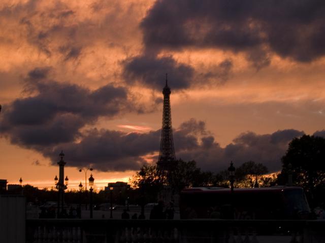
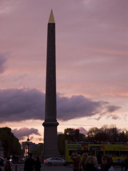
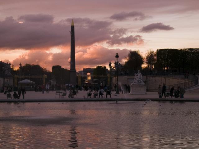
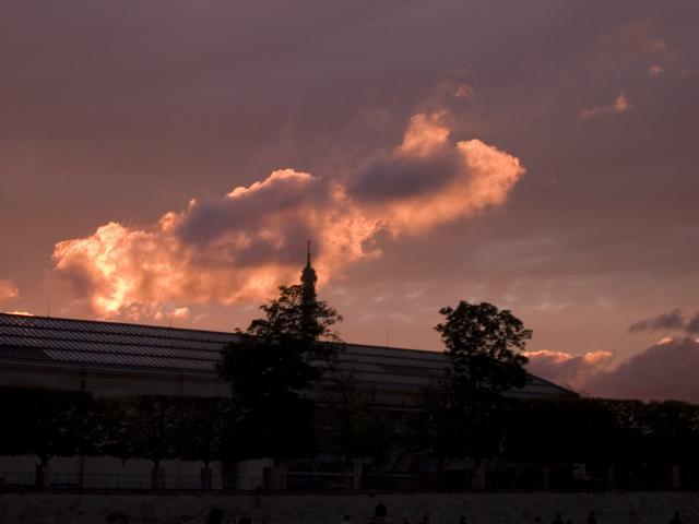
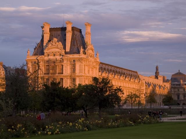

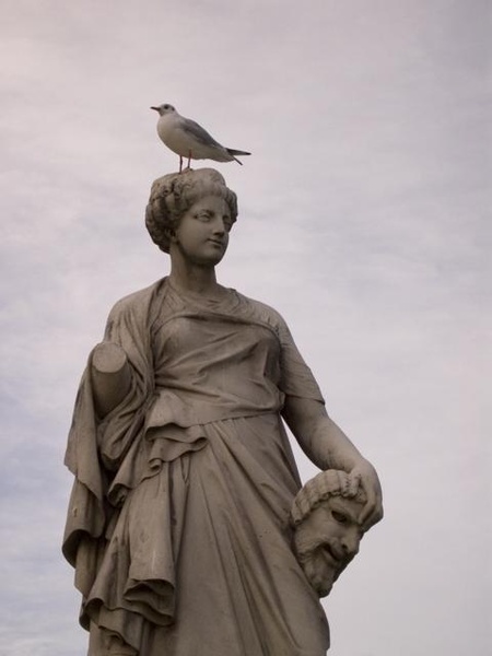
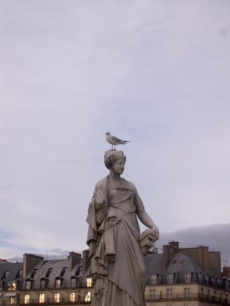
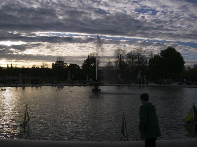
Every fountain in Paris has some kids sailing the little wooden boats around in it. Every fountain in America is full of change. I feel like that might mean something, though it might not be as bad as you think.
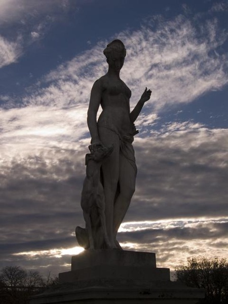
For some reason far more compelling to me than the statues inside the Louvre. The sort of sight that makes me write rambling essays like The Houses We Live In
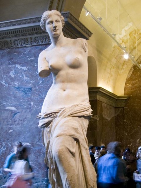
Armless woman over exposed. Am I the only one that sees Venus de Milo and for some reason thinks of Boxing Helena, that terrible movie with Julian Sands? I wish I could kill that association.
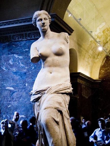
Ah yes the armless woman. You could enjoy The Houses We Live In if you're looking for a way to avoid work.
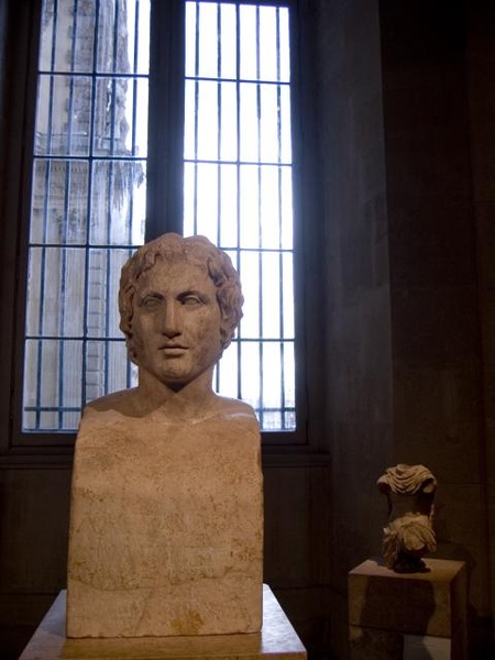
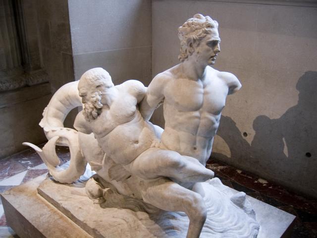
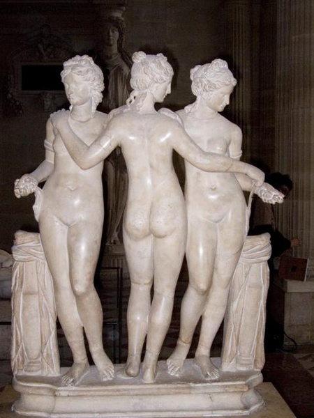
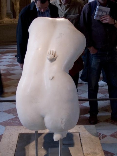
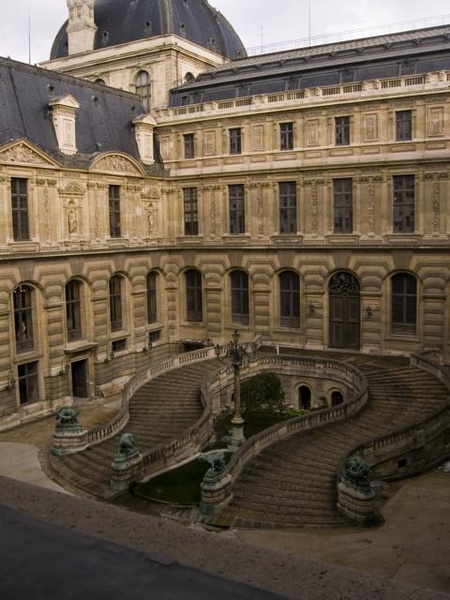

It's hard to take clear images in the Louvre with guards hovering around all the time. And it's not like I'm using a flash, no paintings were harmed in the taking of these images.
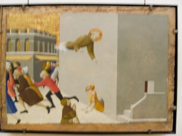
Eerily modern in both style and depiction. This painting dates from the 14th century.

This one reminds me of Henry Darger. If anyone can tell the name/artist here, leave it in the comments -- I'd appreciate it.
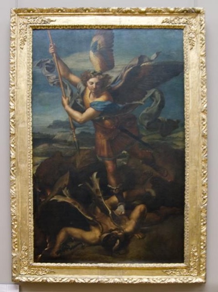
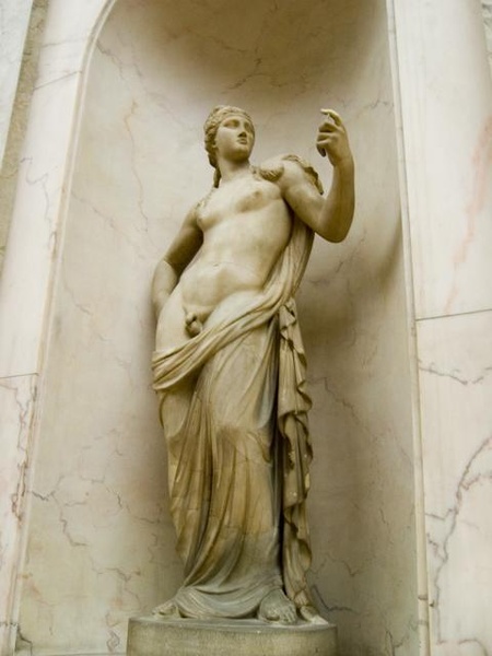
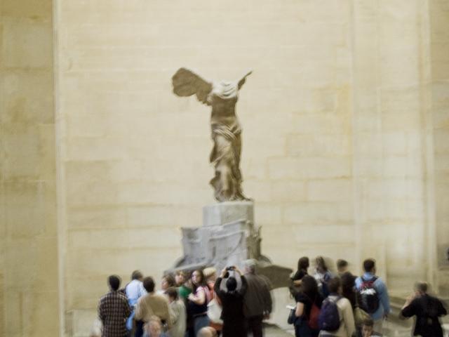
Victory... Unfortunately I jiggled the camera. Still seems that people like it. I guess it looks okay if you stick to the smaller sizes. If you're the type that likes to make your eyeballs bleed reading on the internet, you might enjoy the writing that goes with the images in this set, it's called, The Houses We Live In. Because let's face it I suck at titles.
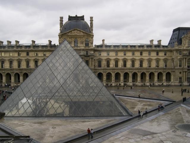
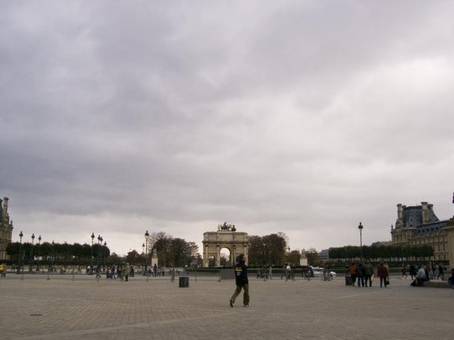
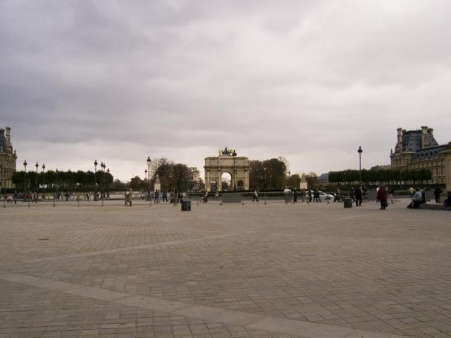
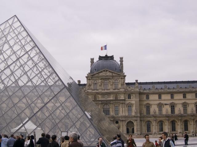
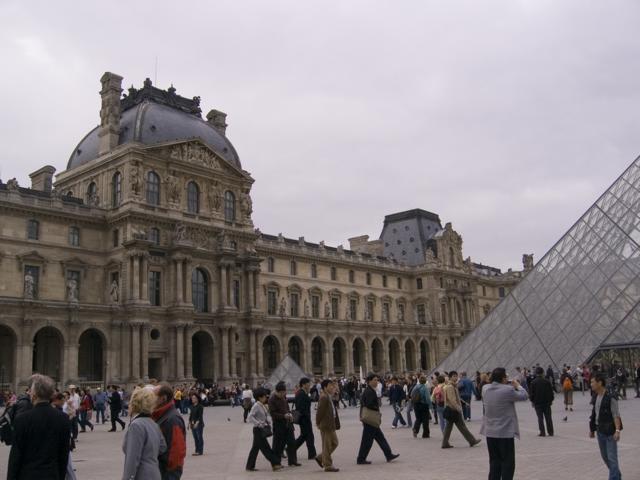
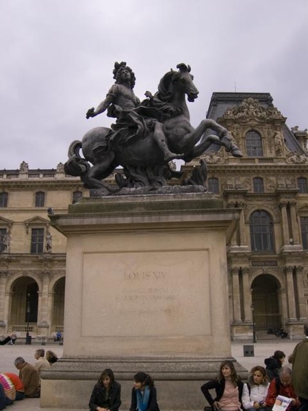
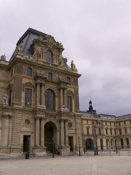
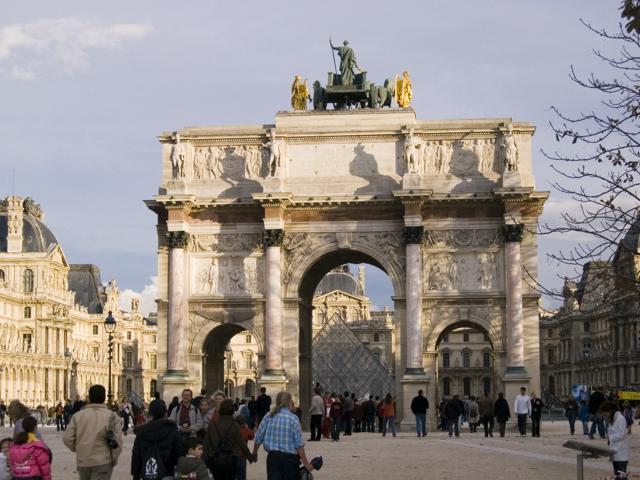
The thing with juxtaposing the modern and the, uh, not modern, is that it somehow seems to cheapen both of them, which is why the pyramid just doesn't work for me. For more thoughts check out The Houses We Live In.
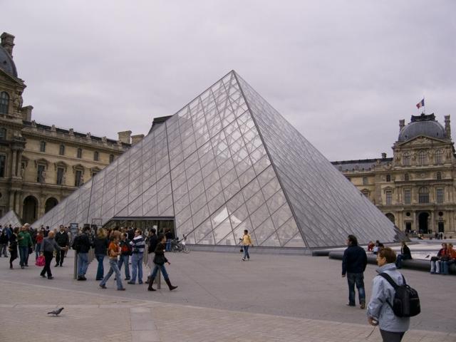
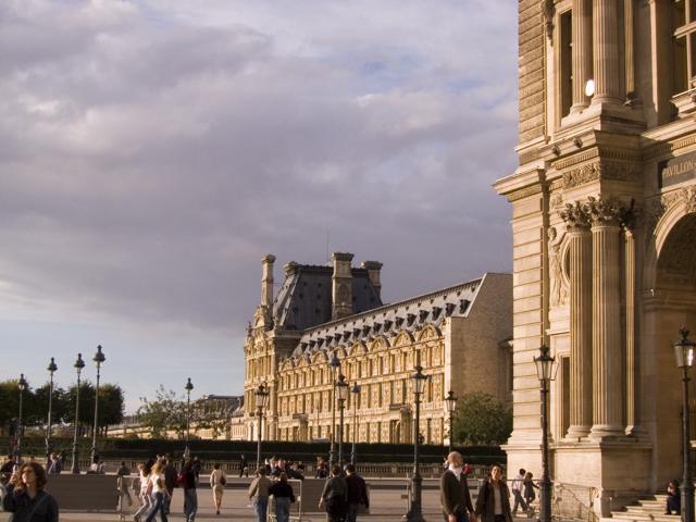
The Louvre. I was commenting that the glass pyramid looks pretty stupid when laura pointed out it was designed by an American. I might even discuss that in the little post about the Louvre on luxagraf.
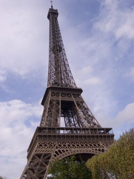
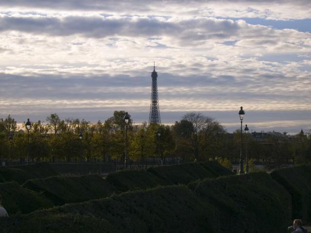
Lying on my back looking up at la tour. For the reading inclined be sure to check out the luxagraf essay entitled The Houses We Live In. The rest of you, carry on beautiful people.