Google champions responsive Web design in page ranking update
This article was published in Ars Technica, you can view the original there, complete with graphics, comments and other fun stuff.
Google has deprecated the desktop Web. It’s still here, but for Google it just got less important.
At least that’s the implicit message in Google’s recent mobile search update. The company is now judging how “mobile-friendly” a site is and is using that metric to weight search results served to mobile devices.
This is the third update in Google’s slow push for Web developers to start building mobile-friendly sites. First, Google announced that it would start calling out sites that used Flash and at the same time rewarding mobile-friendly sites. Initially, that was just a little label next to search results on mobile devices that told viewers the site was “Mobile-friendly.”
Now mobile-friendliness has moved from visual alerts and promos to affecting actual page rankings.
Web developers were apparently confused enough by the change that Google posted a lengthy FAQ along with its announcement last week.
Here’s what the company says: “The mobile-friendly update will boost the rankings of mobile-friendly pages… in mobile search results worldwide. (Conversely, pages designed for only large screens may see a significant decrease in rankings in mobile search results.)” In other words, sites that work on mobile will outrank sites that don’t when all other things are equal.
So what does a site need to do in order for Google to consider it “mobile-friendly”?
The company’s guidelines suggest that the site start by avoiding any content that requires Adobe’s Flash Player. That will probably sound obvious to most developers at this point, but don’t forget that old YouTube and other video embeds were probably done with <object> tags, which means Flash Player. Google suggests updating to the more modern iframe embed method that’s the default on most video hosting sites today.
The other three main criteria in Google’s definition of mobile-friendly are making the site readable without zooming and ensuring that content doesn’t need to be scrolled horizontally (in other words, the site scales to fit on mobile screens). The last one is something that will make anyone with large hands happy: sites need to place links far enough apart so that the desired link can be easily tapped. Fat fingers love white space.
Responsive Web design
There has been a trend sweeping the Web design world for several years now that does all these things and more. If you follow Web design at all, you know that Google more or less just outlined the central principles of what’s known as responsive Web design. Responsive Web design means building websites that function well across devices, even if they look a bit different on each device.
Technically, responsive websites use CSS @media queries and some other techniques behind the scenes that are based on Web standards, Google doesn’t really care how sites do it, however, just that they do it. A site could build out a separate mobile site, use responsive design, or some hybrid form of server side adaptive design; all of those are considered mobile-friendly, but the guidelines themselves could have been lifted from the classic article that started it all, Responsive Web Design.

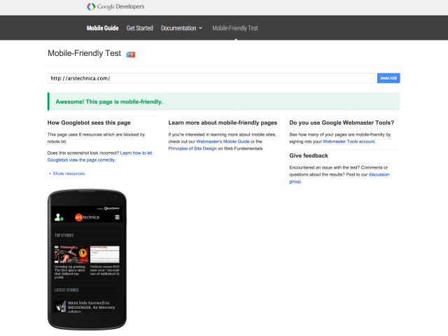
Google has a mobile-friendly test page where you can see how your favorite sites do. Ars gets the mobile-friendly label, but it’s worth noting that the mobile-friendliness of a page is just that—the page. While the Ars homepage comes through with flying colors, if I embed a Rick Astley video in this article using an object tag, this page will not be considered mobile-friendly and might drop in search results. That means a lot of rickroll videos that were embedded back when the object tag was the main method could be dropping out of the rankings.
Also worth asking: what if a page isn’t mobile-friendly, but it’s still useful? What if I, the user, am willing to suffer through the horror of scrolling and pinching my fingers to read tiny text in search of some obscure new information on the Voynich manuscript posted on forum pages that are not, alas, mobile-friendly?
Fear not, my crypto-curious friend. According to Google, mobile-friendliness is only one ranking signal among many. As Google puts it, “If a page with high quality content is not mobile-friendly, it could still rank high if it has great content for the query.”
Still, if there’s a page with great content that’s desktop only and a page with great content that uses responsive design, the second page will presumably outrank the first.
The only real ray of hope in there for developers who still haven’t embraced some form of responsive design is that this change only affects mobile search results. Desktop searches and rankings are unaffected. So if your site doesn’t work on mobile, you’ll only lose, roughly speaking, 35 percent of your traffic.
Now if only Google would start warning me about sites that are just going to hide their content with a “download our app” ad banner that’s so big I can’t even close it on a mobile device. Surely that’s not mobile-friendly?