Ubuntu 18.04: Unity is gone, GNOME is back—and Ubuntu has never been better
This article was published in Ars Technica, you can view the original there, complete with graphics, comments and other fun stuff.
Canonical recently released Ubuntu 18.04, the company’s latest iteration of its popular Linux distribution, nicknamed Bionic Beaver. Ubuntu 18.04 is a Long Term Support (LTS) release and will receive updates and support from Canonical until April 2023. But more notably…
Unity is gone. GNOME is back. And Ubuntu has never been better.
The demise of the company’s Unity desktop, which Canonical abandoned to focus on its work for server and IoT systems, comes nearly seven years after it first replaced GNOME 2. While the Unity user interface was very much a love it or hate it experience, it was (for better or worse) the thing that defined Ubuntu for nearly the past decade. You might think the end of Unity would leave Ubuntu rudderless and drifting, but I’d argue it has done just the opposite.
Bionic Beaver marks the first time LTS release users get a look at Ubuntu’s new GNOME-based desktop. And for the first time in quite a while, Ubuntu feels like a distro that is firing on all cylinders, turning out what might be its strongest release ever, in an LTS package no less. Not only is 18.04 well worth the upgrade—especially for those coming all the way from the last LTS release (16.04)—it’s worth checking out even if you use a completely different distro.
If you’ve been using last autumn’s 17.10 release, you’re already familiar with the new, slightly customized version of GNOME arriving to replace Ubuntu’s Unity desktop. That said, 17.10 was very much a test release, one that had some serious hiccups thanks to an installer bug that wiped out some hardware. With 18.04, the testing is over and polish has been applied (and in some cases things have reverted back to even stabler options). In my several months of testing throughout the beta release cycle, 18.04 has performed rock solid.
While much of the work for this release has gone into the transition from Unity to GNOME and making sure that’s a smooth experience for desktop users, that’s far from the only story here. In fact, that effort isn’t even the most interesting part of what’s new in 18.04. Much of what’s great in this release isn’t aimed at the desktop. Rather, server users deploying Ubuntu on any one of the major cloud platforms will really enjoy this latest iteration.
That reality might be a little disconcerting to desktop users, many of whom are already convinced Ubuntu is going to abandon the desktop in favor of the more profitable worlds of server and IoT, but I don’t think that’s the case. If nothing else, Canonical knows developers need a solid desktop on which to do their work, so Ubuntu is unlikely to get rid of its desktop just because it’s less profitable. While it’s purely anecdotal, most developers I’ve met and worked with who used Ubuntu did so because they got used to it on a server first. That’s why it makes sense of Canonical to focus on servers: not only is it where the money is, it’s where a good portion of its desktop users is coming from.
Even if the desktop became a purely communally driven project with very little input from Canonical—which, again, I don’t see happening, but hypothetically—I think it’s in a better position to survive, even thrive, with its new GNOME interface than with Unity. GNOME certainly isn’t going anywhere, and while Canonical has already started contributing upstream, the bulk of the work being done is well outside Canonical’s influence. By comparison, Unity was solely the work of Canonical developers.
So the short story is Unity is gone, but there’s no need to panic. Not only is the transition to GNOME pretty smooth thanks to Canonical’s tweaks to GNOME Shell, there are plenty of other flavors of Ubuntu out there to choose from. There are, in fact, seven official flavors of Ubuntu, most of which offer an LTS release (though in the case of flavors, LTS usually means three years, not five). We’ll look closer at several flavors of Ubuntu, but first it’s time to reflect on the new default GNOME most users will see.
Ubuntu GNOME
For those upgrading from the last LTS release, you’re in for something of a shock. This is without a doubt the single biggest change in an Ubuntu release since Canonical dumped GNOME 2 for Unity. Nearly every part of Ubuntu 18.04 has changed, been improved, or is completely new compared to 16.04. There’s a new desktop, a new lock screen, some new default apps, and (of course) a new kernel under the hood.
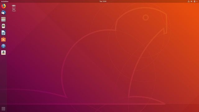
I’ll start with the most immediately obvious change, the new GNOME desktop. I won’t sugar coat it; the most challenging part of the transition to GNOME will be potential changes in workflows that will happen because of differences between Unity and GNOME. That said, the change is surprisingly easy to make in most cases. Ubuntu’s developers have done an impressive job of styling GNOME to match Unity in looks, if not entirely in function.

To help users transition from previous releases, Canonical has created a little “first-run” app called “Welcome to Ubuntu.” It points out some of the most-used new features and highlights where things are in the occasionally inscrutable GNOME interface. It’s not quite as in-depth and useful as Ubuntu MATE’s Welcome app, but it should get you up and running and point out some apps you might want to install (all of which are Snap applications; more on that below). This is also the place to opt out of Ubuntu’s data gathering, which grabs some statistics about your system hardware.
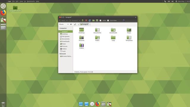
For the most part, how the transition to GNOME goes for you will boil down to a simple question—did you use the HUD, the keyboard-driven menu selection feature in Unity? If the answer is “yes,” you’re going to hate GNOME Shell. If the answer is “no,” you’ll probably be able to switch to GNOME without too much trouble. If you were a HUD user and you don’t want to learn a new workflow, I have two options for you. One is to install the version of Unity 7 that’s in the Ubuntu repos. It’s community supported and seems to be active so far. Option two is to switch to Ubuntu MATE and change the desktop theme to “Mutiny,” which has a HUD-based feature. With a little fiddling in the config editor, that can be made to mimic Unity pretty closely.

If you weren’t a HUD user, your transition to GNOME will likely be much smoother. Ubuntu 18.04 looks roughly the same as 16.04, which helps smooth the transition to GNOME somewhat. After all, Unity was built on top of the same GTK libraries, GNOME components, and GNOME apps as, well, GNOME. That means most of the apps and interfaces you’ll be using in GNOME will be very similar to what you used in Unity.
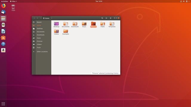
There are some exceptions, though. Files, the default GNOME file manager app, is a good example of the sort of subtle but important differences between 16.04 and 18.04. In Unity, Ubuntu used an older version of Files and heavily patched it to add some functionality that had long since been deleted by the GNOME developers. In 18.04, all that work has been tossed out. Files is up to date, and there are no patches. That means there are some new features, like the ability to tag files and a new search interface.
Perhaps the biggest change from stock GNOME in Ubuntu 18.04 is the ability to put folders and files on the desktop. GNOME developers consider the desktop concept outdated, and they use the “desktop” pretty much as a wallpaper display tool. Ubuntu has done a bit of tweaking so that you can actually put launchers, folders, and files on your desktop, which should be welcome news for many Ubuntu users. How long that will last is an open question, though, since GNOME just completely removed the code that made it possible for Canonical to enable this feature. For now at least, if you want files and folders on your desktop, you’re all set.

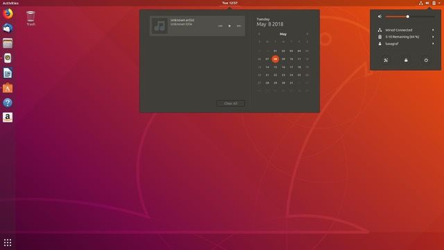
Another potential source of pain for Unity refugees coming into the GNOME fold is the top bar, which behaves a little differently in GNOME. It has app indicators, status messages, network controls, and user sessions like Unity, but this iteration also adds a different app menu and a calendar applet in the center of the screen. There’s also something like a global menu, minus the menu. When apps are maximized, the name of the app appears in the top menu, along with a one-item menu—quit is generally your only option. A couple of apps have a few extra items in their menus—Terminal and Files, for example—but it’s a far cry from the menu-in-top-bar feature of Unity.

Another thing you’ll notice in this release is that the window management buttons are back on the right side of the title bar. You can change this with the GNOME Tweak Tool if you’d like them back on the left.
Once you get past the differences with Unity, however, there’s much to like about this release. GNOME Shell is different from Unity, but it’s not necessarily worse. It’s certainly a pretty desktop, and Ubuntu’s default theme has received quite a few updates that make it look really nice, especially in Files. There were rumors of a brand-new theme, perhaps one that doesn’t involve any brown or orange even, but that did not materialize in time for this release. And of course, there are plenty of GNOME themes out there if you’d like to try something else. I reverted to stock for the screenshot here, but I generally prefer the dark variant of the Arc theme.
Ubuntu 18.04 ships with GNOME 3.28, which has a number of new features worth mentioning. There’s a new Night Light app, which warms your monitor’s color temperature after sunset to lessen eye strain. There’s also improved support for Thunderbolt 3, and there are media player controls in the message tray, which supports just about all the popular media players, including Rhythmbox and Spotify.
This version of GNOME Shell also features a much improved system for dealing with those annoying “captive portal” dialogs you get from many public Wi-Fi hotspots these days. For me, browsers have always been hit or miss at dealing with these, but GNOME’s tool has yet to miss, and that alone is almost enough to make me use it on a daily basis. (Full disclosure: I am an i3wm user, not because I especially love tiling window managers, but because it’s easy on the RAM and because I just don’t need my “desktop” to do much. If it displays apps on-screen and doesn’t crash I’m happy).
Once you get past the move to GNOME, you start getting to the real meat of this release.
Among the most exciting additions for me is the new minimal install option in the Ubuntu installer. Not to be confused with the minimal ISO image, this new minimal install option varies a little between Ubuntu flavors. The basic idea is to install a bare-bones desktop and leave the rest of the app selections up to the user. With the minimal install, you won’t get office suites or media players, just a basic desktop, Web browser (usually Firefox), and a terminal app. If you don’t need all the extras but don’t want to start as bare bones as a server install image, the Minimal Install option is another welcome addition (hat tip to the Xubuntu project, which had the initial idea for a minimal install option). Personally, this is the only way I’ll install Ubuntu from here on out.
Similarly welcome is Ubuntu’s new Snapcraft store, which hosts quite a few very big-name software packages, including LibreOffice, Firefox, Chromium, Skype, and Spotify to name a few. The new Ubuntu Software app makes it very easy to install Snaps, and 18.04 includes quite a few Snap apps out of the box: the system monitor, desktop calculator, and a few others are all Snaps out of the box.
Snap apps make it easy to get the latest version of an app without updating your whole system, (somewhat) independent of the distro itself. That means you can track 18.04 LTS for the next five years for a stable system but still get the latest version of Skype through your Snap. In some ways, it’s the best of both worlds, though it’s not without some quirks. Right now the most noticeable thing is that Snap apps will generally not pick up third-party GTK themes and can look a little out of place. I’m guessing this is why Firefox is not, by default, a Snap app. The bigger issue that comes up with some apps is slightly different functionality due to Snap’s stricter sandboxing. LibreOffice is the main one I’m aware of that’s affected by this limitation.
Snaps aren’t just for apps, either. The Ubuntu community is working on a new theme—currently called, creatively, Communitheme—which you can try out via a Snap. I couldn’t find it in the Software app, so for this it seems you must use the command line. At least that’s pretty simple, just type: snap install communitheme and you’re done.
Another major change under the hood (or lack of change, depending on how you look at it) is the absence of Wayland in this release. Ubuntu made Wayland the default display manager for 17.10, but it has reverted to X.org for the LTS release. It’s a sensible change upon reflection given Wayland’s long list of incomplete features like, for example, the lack of support for screen sharing in chat/VoIP apps and spotty support for VNC tools. Those are both staples of the corporate world, which is a big part of the user base that will be upgrading to 18.04.
Wayland just isn’t there yet—perhaps in 20.04. Naturally, you can use Wayland if you want. It’s even installed by default, but you’ll just have to manually select it from the login screen. Speaking of which, the login screen is now the GNOME Display Manager (GDM3) rather than the LightDM that Unity used.
When you first install (or upgrade) to 18.04, pay attention to the little Welcome screen and its various messages because one of them will help you enable support for Livepatch, which means you can install Kernel updates without rebooting. It’s not that big of a deal for desktops, since rebooting your work station isn’t that disruptive. But livepatching in the server is much more useful. The ability to livepatch your kernel without restarting the server is huge for sysadmins trying to keep production servers up to date and secure.
Speaking of the kernel, Ubuntu 18.04 ships with Linux kernel 4.15. That means a slew of hardware support updates; exactly how many will depend on whether you’re updating from 16.04 or later. Either way, you’ll find better support for the latest and greatest hardware, whether it’s graphics cards, USB devices, keyboards, or other peripherals.
One last notable change happening under the hood: if you’re updating from 16.04, Ubuntu now uses a Swapfile instead of a Swap partition during installation. This only applies to new installations, so, if you upgrade, your swap partition will remain. If you nuke and pave, though, you won’t need to create a swap partition.
Ubuntu Server
Notable new features in Ubuntu Server 18.04 include the already mentioned Livepatch feature and a new version of the server installer, which makes the install process very similar to the Desktop release, complete with familiar live session GUI, LXD 3.0 (see the release notes for everything that’s new in LXD 3). This latest server update also offers a major QEMU update with fixes for Meltdown/Spectre and a new version of Nginx with support for HTTP/2 push requests.
There’s quite a bit of work going into the virtualization front as well, with new versions of cloud-init and MAAS, Ubuntu’s UI to provision all your Ubuntu servers from a single interface.
Then there’s a massive amount of work that has gone into optimizing Ubuntu for various platforms, like optimizations to speed things up on AWS, Azure, and others. Few other distros have time or resources to do this, so it’s no small part of the appeal of using Ubuntu on the server.
Other flavors
When Ubuntu announced it was moving to the GNOME desktop as its default, there was some pushback from users who felt their favorite desktop would have been a better choice. Ubuntu founder Mark Shuttleworth wrote on his blog that “we’re using GNOME, but we’re the space where KDE and GNOME and MATE and many others come together to give users a real and easy choice of desktops.”
There are seven other flavors of Ubuntu with LTS releases for 18.04—Kubuntu, Ubuntu MATE, Xubuntu, Lubuntu, Ubuntu Budgie, Ubuntu Kylin, and Ubuntu Studio.
All have enough new features to write separate reviews in their own right, but two deserve a quick mention. The first is Kubuntu, which for my money is the flavor to beat. If you haven’t tried KDE lately, you really should give Kubuntu a go. KDE is no longer the memory hog it once was, and Plasma 5.12 offers an incredibly nice, polished, and smooth experience. The Kubuntu project does a great job of tweaking KDE’s sometimes questionable defaults to create a much better experience than a stock install.
This release switches to the Breeze dark theme, makes double-click the default, includes the new Plasma Vault app for encrypting folders, and has been rock solid in my testing (even early betas). This will be my go-to install for less technical users who want to try Linux over Windows.
My other favorite flavor is Ubuntu MATE, which has turned out another outstanding release. The new MATE fixes the one issue I had with Ubuntu MATE 17.10: less than stellar HiDPI support. That’s now a thing of the past, as MATE handles HiDPI screens right out of the box. I often see MATE suggested for users with older hardware, which it might partly be good for (Lubuntu is probably even lighter on resources, though). For me, MATE seems like a blazing-fast option on even the latest and greatest hardware.
As noted above, it also features a theme called Mutiny, which closely replicates many of Unity’s features, including the HUD. You’ll also find hardware acceleration in Marco (MATE’s window manager), a new app menu, and some improvements to the Software Boutique.
Xubuntu may also be worth a look, as it has taken an interesting direction in swapping some GNOME apps for their MATE equivalents. Most users probably won’t notice the difference, but it’s got me wondering if downstream projects aren’t getting a little nervous about the state of, and future of, GTK.
For one last flavor to note, Lubuntu has pushed out what will likely be its final LXDE-based LTS release; the project will be moving to LXQT for 18.10 later this year. If you want to try the LXQT version now, search for “Lubuntu Next.” Later this year, Lubuntu Next will become Lubuntu, and the current Lubuntu will be known as Lubuntu Classic.
Conclusion
Ubuntu 18.04 is a huge update, but I say that mostly in the best sense of big updates. It brings a ton of new stuff, both under the hood and on the desktop, without creating too much disruption to your workflows. The one exception to that is HUD users, who may want to stick with the version of Unity still in the Ubuntu repos.
Canonical generally takes a conservative approach to LTS updates. Existing 16.04 users will not be prompted to upgrade to 18.04 until the first point release is out, and usually that happens around June or July (but it depends on bugs and patches). I would also expect to see Windows Update make it easy to integrate 18.04 into hypervisor on a similar timeline. But if you’re already on 17.10 and don’t want to wait—and for the average user, I don’t see any reason to wait—you can update now by following Canonical’s directions. The best Ubuntu offering in years will be waiting for you either way.