Ubuntu 14.04 review: Missing the boat on big changes
This article was published in Ars Technica, you can view the original there, complete with graphics, comments and other fun stuff.
Canonical pushed out Ubuntu 14.04 last week. This release is the first Ubuntu Long Term Support release in two years and will be supported for the next five years.
It feels like, for Canonical at least, this Long Term Support release couldn’t have come at a worse time. The company is caught in a transitional phase as it moves from a desktop operating system to a platform that spans devices.
The problem for Canonical is that it’s only about 90 percent of the way to a platform-spanning OS, but it just so happens that the company’s schedule calls for a Long Term Support release now.
Long Term Support releases are typically more conservative and focus on stability and long-term maintenance rather than experimental or flashy new features. Things that are 90 percent done don’t make it into LTS releases. And, unfortunately for Canonical, most of its foundation-shaking changes to Ubuntu are currently only about 90 percent done and thus not part of this release.
The two biggest changes on the horizon are the Mir graphics stack and Unity 8, neither of which are part of 14.04.
Mir just isn’t ready for primetime yet, and even the halfway step of xMir (which falls back to the X display server when it needs to) isn’t ready enough to land in an LTS release. Were this not an LTS release, it seems likely xMir at least would be included. As it stands, the graphics stack in 14.04 is—aside from incremental upgrades—the same as it was in last year’s 13.10.
Likewise, Unity 8 will not make its debut in this release. The next version of Ubuntu’s flagship UI isn’t quite there yet, at least on the desktop. Now, this puts Canonical in the unfortunate position of needing to support Unity 7 on the desktop for five years going forward.
Ubuntu is planning to ship its first mobile devices later this year, which will use Unity 8, since the mobile version is much further along than the desktop. Thus, when Ubuntu Mobile launches, Canonical will find itself having to maintain two separate platforms, both Unity 7 and 8, with Unity 7 desktops hanging around for a minimum of five years.
While Ubuntu 14.04 might be most notable for what it is not—namely the next-generation version of the Ubuntu desktop—it is nevertheless an important update, because for those users sticking with LTS releases, it represents the first major change in two years. And a lot has happened in Ubuntu land in the time since 12.04 was released.
There have been major leaps forward in the form of upstream kernel updates, application updates, and several major user interface changes in Unity.
It’s also the first time LTS users will have to deal with the Amazon Search Lens and Ubuntu’s new privacy policy.
The kernel
At the core of Ubuntu 14.04 is the Linux kernel 3.13.0-24.
The previous release, Ubuntu 13.10, used the 3.11 kernel, and the last LTS release, 12.04.4, currently ships with 3.8. A lot has changed since 3.8, primarily in the form of better hardware support, but there are some welcome improvements in this latest kernel release even for those already running 3.11 in Ubuntu 13.10.
How much the kernel update impacts your Ubuntu experience will depend a little bit on your hardware. For example, if you’ve got dual GPU hardware that uses Nvidia Optimus to switch between GPUs—one optimized for performance and the other for conserving power—the move from 12.04 to 14.04 will be huge. As of the 3.12 kernel, there’s now low-level support of GPU switching (which should happen automatically).
Users with SSD-based machines should see better performance in this release, partly because of some improvements in the kernel, but also because Ubuntu now ships with TRIM features enabled by default. There are some horror stories about TRIM support in Linux floating around the Web, but those issues have largely been solved.
That means you can delete those cron jobs running the fstrim command and stop worrying about adding “discard” to all your fstab entries. Ubuntu 14.04 will handle this automatically, right out of the box. If you’re running Ubuntu on an SSD, you will likely notice a speed improvement, particularly in anything that requires a lot of data being written to disk.
Another of the headline-worthy changes in the 3.13 kernel is the addition of support for nftables, which will eventually replace the iptables firewall tool. Nftables is more than just a replacement for iptables, it’s a complete reworking of the way the kernel handles packet filtering. Right now nftables is not quite ready for prime time, and the command line tool nft is not installed by default. But when the 3.15 kernel rolls around (which will be well within the lifespan of Ubuntu 14.04) nftables can replace your iptables-based firewall.
Battery life improvements
Power management remains one of the weak points in Linux, with battery life lagging far behind what you’ll find in Windows and OS X running on the same hardware.
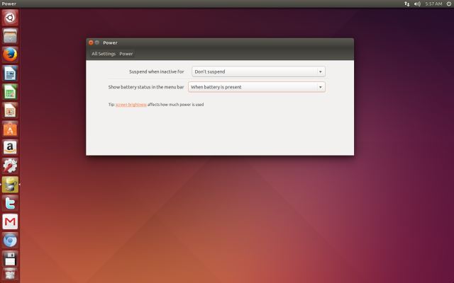
The good news for laptop users is that several recent kernel updates related to power management have dramatically improved battery life, and these are all part of Ubuntu 14.04.
I started using 14.04 when the final beta was released in March and immediately noticed a huge difference in battery life on my primary machine, an early-2013 Retina Macbook Pro. It’s hard to say whether these improvements come from the kernel updates or perhaps some Unity-level improvements, but whichever is responsible, it’s a big improvement over Ubuntu 12.04.
I typically use only a handful of apps, primarily a Web browser—Chromium with anywhere from 20 to 80 tabs—and a Terminal session with several Tmux sessions running inside it, which I attach and detach depending on what I’m doing (for development and writing I run zsh, python, ruby, vim, mutt, cmus). None of that should produce a huge battery drain. I also occasionally use Darktable and Gimp for image editing, which of course shortens the battery life. I should note that I use a Chromium add-on that suspends background tabs and significantly reduces Chromium’s overall system footprint even with the large number of tabs I typically keep open.
This setup, which is pretty minimalist in terms of battery draining apps, would still manage to drain the battery in under four hours in Ubuntu 12.04, sometimes not lasting much more than three hours. I switched to running Ubuntu in VMware (using OS X as the base system), and battery life improved somewhat, consistently lasting about four hours, but that’s still not very good.
In 14.04, with the same workload on the same machine, the battery lasts just over 4.5 hours on average. That’s actually a pretty significant improvement and would be worthy of praise did it not still lag far behind OS X (6.5 hours) and the minimalist Crunchbang Waldorf (currently my primary OS), which lasts nearly as long as OS X itself—well over 6 hours. Crunchbang and Ubuntu share the same Debian core and Linux kernel, which most likely makes Ubuntu’s Unity interface the primary source of the additional battery drain.
That’s been my experience with battery life thus far in 14.04, but remember that real-world battery stats are highly subjective. Hardware, system setup, and the details of what you do make it nearly impossible to guarantee anything. That said, based on my experience with 14.04 on three different laptops, you’ll likely see at least some improvement over 13.10 and even more so if you’re upgrading from 12.04.
The Unity desktop
While Canonical is playing it safe with most things in this release, given the LTS nature of 14.04, there are some surprising and very welcome changes to the Unity interface. The biggest news on the Unity front is that Canonical has done an about-face on a number of long-requested features previously rejected by the Ubuntu development team.
Menu in windows
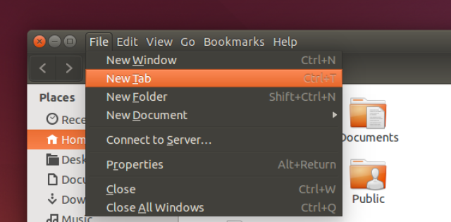
The first and most notable change in Unity is a new option to turn off the global menu bar and put application menus back in the window.
Part of the rationale behind the decision to move the window menus out of the window and up into the global position was to save space. This made sense back when Unity was an interface for netbooks and other small screen devices, but it doesn’t hold water on a 27” HD monitor.
There are other arguments for global menus, notably Fitts’ Law, which, among other things, says that it’s easier to throw your mouse to the top of the screen than it is to try to hit any target within the screen. That’s true, and countless studies have confirmed it, but there’s a counter-argument to be made that it’s equally difficult to get all the way back to where your cursor was before you went to the global menu with that flick of the mouse.
It would seem that there are advantages and disadvantages to both approaches, and which is best depends on how you work; it would be disingenuous to try to categorically say one is better than the other.
Ubuntu is one of the few Linux distros that uses something like a global menu, and, until this release, that was the only option. Now, though, you can opt to go back to window-level menus if you prefer that approach.
It’s a nice option to have, because Ubuntu’s global menu is, frankly, a mess.
The most notable global menu in a desktop OS is undoubtedly the Mac OS, which has used a global menu since it debuted in 1984. But the reason OS X’s menu works so well isn’t just because Fitts’ law is followed; it’s also that the menus and the items in them are standardized across the OS.
For example, preferences are always in the application menu and always accessed with the keyboard shortcut cmd-,. That consistency makes for a simpler, more unified user experience. The user never has to think, now where are the preferences in this new app I just installed? Likewise they don’t have to look to see what the keyboard shortcut is to open the app’s preferences window, they just hit cmd-, and the preferences window opens.
Ubuntu, for reasons beyond its control, will never be able to achieve this level of OS interface consistency, which makes its global menu next to useless.
In fact, the Unity global menu is not a global menu at all, it’s a window-specific menu that got kicked up to the top bar for reasons only known to Ubuntu developers.
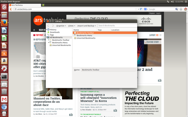
No matter what kind of window is open in the application, the global menu in OS X remains the same. In Unity, however, as Ryan Paul noted in his review of Ubuntu 12.04, “despite displaying the menu contents outside of the window, the menus are still window-specific. By design, the global menu bar displays the menu of the focused window. This proves awkward in some applications with dialogs and multiple windows.”
It’s not just awkward, it’s potentially crazy-making, as it means your menu items (which you can’t see until you drag the cursor up to the top of the window) may or may not actually be there depending on the type of window you have in the foreground right now.
Say you’re browsing the Web with Firefox and you decide you want to edit a bookmark. You click the Firefox menu item “show all bookmarks,” which opens a new window with Firefox’s bookmark manager. But of course this window does not have a window-level menu, which means your “global” menu at the top of the screen is now unavailable. That also means your keyboard shortcuts won’t work, a curious bit of consistency I suppose. So in this window, when you hit control-Q (Quit) nothing happens. Do the same when a regular browser window is at the forefront and Firefox will happily quit.
This isn’t a problem limited to browsers. The same situation arises in the Nautilus file manager. Just open a Property inspector window and see what the “global” application menu does (hint: there suddenly isn’t one). If you create a file or even just open a new window with a keyboard shortcut, you’ll need to first make sure that a “normal” Nautilus window has focus.
Nothing in Ubuntu 14.04 fixes the half-implemented nature of Ubuntu’s “global” menu. In fact, nothing has changed at all in the default installation of 14.04. You’ll have to go hunting in the system settings to find the new option to put menus back in the windows (it’s tucked away under the Behavior tab in the Appearances panel), but at least it’s now an option.
Naturally Ubuntu has put it’s own spin on what window-level menus look like. Unlike other operating systems, which typically put window-based menus in a row under the window title bar, Ubuntu has opted to put them in the actual title bar. The window-level menu is, as with the global menu, hidden away until you hover your mouse over the window.
One nice touch is that the menu items in the title bar manage to never get in the way of click-and-drag operations on the window. Canonical’s developers deserve much credit for making sure that this potentially disastrous UI decision actually works without a hitch.
As a former OS X user, I would prefer to see Canonical try to make a true global menu that works as well as Apple’s, but in lieu of that, I can at least have the consistency of menus in the window.
Minimize to launcher
The second much-requested feature that Canonical has finally granted its users is an option to minimize windows to the launcher by clicking the icon in the launcher.
The default behavior remains the same; when you click an icon in the Unity launcher, the application launches. If the application is already running, then it is brought to the foreground. If you click it again (when it’s already the frontmost application) nothing happens.
There’s been a long-standing request to change this last behavior to mirror what you’ll find in several other desktops, namely that clicking the icon of the frontmost application will minimize that window.
To enable this behavior in Ubuntu 14.04, you’ll need to install and open the Compiz Settings Manager and click the Unity plugin, where you’ll see an option that says “Minimize Single Window Applications (Unsupported).”
Despite the name, you can minimize multiple windows. If you have two or more windows open, and you click once on the icon in the launcher, the application will be brought to the front if it isn’t already. Click again and it will move to the Unity window spread/switcher mode with the windows arrayed on a grid. Click the launcher icon again, and all windows will be minimized. Click a fourth time, and the window that had focus when all the windows were minimized will be brought back to the front while any other windows remain hidden.
Technically this feature is considered experimental and unsupported, but in my testing there were no issues and everything worked, if not quite as the wording would lead you to expect, at least consistently.
Small changes that make Unity in 14.04 more usable
To animate resizing a window in previous releases, Ubuntu used a yellow rectangle to show the size of the window. The yellow rectangle is still used with window snapping, but resizing now uses live window animation. The live window resizing was an option in 13.10, but this is the first time it has been enabled by default.
There’s another useful new feature half-hidden in the application window spread view, that is, the view you get when you click the Unity Launcher icon for an app with multiple open windows.
In 14.04, if you just start typing in the spread view (there’s no text entry box, which is why it qualifies as half-hidden), Ubuntu will filter your windows and highlight the one that matches your search. If you keep dozens of windows open in a single app and frequently lose track of what’s where, this makes a quick way to find what you’re after. This feature becomes even handier if you add a keyboard shortcut to toggle the window spread view (by default there isn’t one, but you can set one in the Compiz Settings Manager >> Window Management >> Scale and then click the Binding Tab).
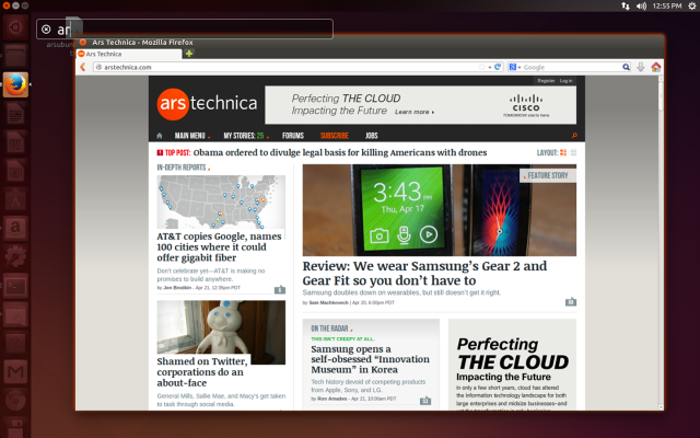
With a keyboard shortcut you can activate the window spread view, type to find the window you want and switch to it without ever taking your hands off the keyboard.This would be a fantastic tool if it could spread out tabs within an application—particularly Web browsers—but it doesn’t; it’s only a window-level feature.
The Unity dash
If you upgrade to every new Ubuntu release, there’s nothing new to see in Dash of 14.04. If you stick with LTS releases, though, the Dash has some very big changes you may have heard about—namely that, starting with 12.10, by default the Unity Dash will forward your search terms on to Canonical’s servers which then query all manner of Web services, including Amazon.com.
There are two things annoying about this. First it clutters your search results with (often NSFW) junk when all you want is to find a file. The second and the far more serious problem is that it gives Canonical a massive amount of data about you.
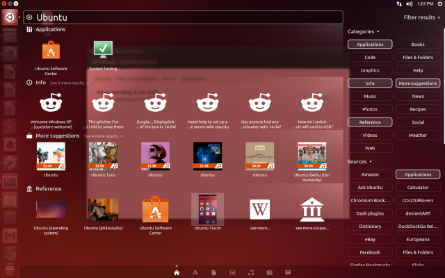
When it debuted in 12.10, the online search tools caused a privacy uproar with the Free Software Foundation (FSF) and the Electronic Frontier Foundation (EFF) calling for Canonical to remove what in many users’ eyes amounts to spyware.
Nothing has changed on this front since 12.10 was released. By default your searches are still sent to Canonical and on to, well, who knows really? Which is why we suggest disabling this feature by completely uninstalling it in the Ubuntu Software Center.
There has been some talk of Ubuntu offering more fine-grained controls over how and where your data is sent, but as of this release that hasn’t happened. The privacy controls are still more or less the same—a single on or off switch controls all your online search tools (not to be confused with the online accounts privacy controls, which do offer more fine-grained control over which apps can access your accounts).
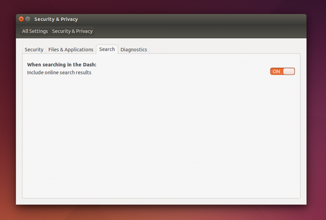
The good news is that it looks like Canonical is finally going to make the online search components of Ubuntu opt-in, though not—some might argue conveniently not—in time for this LTS release. If you’re just one person upgrading, turning off these features isn’t that big of a deal, and the EFF has some instructions on how to do it. A couple clicks and you’re done.
If you’re upgrading an enterprise-level deployment of Ubuntu and you have thousands of machines to deal with, disabling the online search features in each one is going to be a pain. Enough of a pain that you just might want to skip this release and wait for the next LTS in two years (or move to another distro). After all, Ubuntu 12.04 won’t reach the end of its LTS lifespan until April 2017.