Hands-on with Vivaldi, the new Web browser for power users
This article was published in Ars Technica, you can view the original there, complete with graphics, comments and other fun stuff.
It’s been a long time since a brand new desktop browser landed on the Web. Web newcomers might even be forgiven for thinking that there have always been just four such browsers: Internet Explorer, Firefox, Chrome, and Safari.
After the vicious early days when the world of Web browsers closely resembled the ruthless world of the railroad barons a century earlier, the browser market settled down to something pretty boring. First there was IE and Firefox. A few years later, Apple introduced Safari. Several years after that, Google launched Chrome. And since Chrome arrived in 2008, the Web hasn’t seen another major browser launch—until now.
The browser is dead, long live the browser
Part of the reason no one seems to be building new browsers is that it’s a massive undertaking. Another part, though, is likely due to the rise of mobile devices, which have spawned a thousand browsers that are all quietly, invisibly embedded into other applications.
Site-specific mobile applications like the Facebook or Twitter apps push the browser into the background. When you click a link in these apps, the pages just appear. Behind the scenes an embedded browser handles everything without switching to whatever dedicated browser might be installed on the device at hand. In fact, there’s little need for a dedicated Web browser at all these days if you spend most of your time in mobile applications.
Desktop browsers have largely followed this overall trend of slipping into the background. Every new release sees them simplifying their interfaces and removing features that their data collection tools indicate are only used by a small handful. RSS icons disappear, toolbars get hidden away, the URL bar will likely disappear soon for many.
This ends up working out well for most, especially since, as Google infamously demonstrated some years ago, many people have no idea what a Web browser is or even that they’re using one. The simpler the interface, the less the average user needs to think about anything other than what they want to see or do on the Web.
Given that success in the browser market is measured in market share, this is not surprising. The less sophisticated user will always be the most plentiful, and browsers will always chase the numbers.
That’s not a bad thing, as it helps to get more people online. This approach improves the experience for the majority. Most people reading this have long since forgotten it, but there was a time when we, too, had no idea what all those inscrutable icons littered around the browser windows actually did.
There is, however, still that five percent that actually did use the RSS icon, liked their status bar, and will most likely abandon any browser that hides away the address bar. The power users may be the minority, but they still exist. Exactly what constitutes a power user is up for debate, but looking at the recent history of Web browser “advances” one thing seems clear, the power user is not the target audience. The person who wants to be in control of their experience and customize it to their liking has been left behind by most browsers.
Vivaldi: A new browser for power users
The power user’s current solution to the simplification, arguably the infantilization, of the Web browser interface is to get all those missing features back with add-ons. This works to a degree, but it introduces a ton of extra code, some of it written by programmers far less capable than those contributing to the code of Firefox or Chromium. This inevitably means add-ons slow things down. The problem is bad enough that a future version of Firefox will even have a feature dedicated to letting you know which of your add-ons is slowing you down.
Savvy Ars readers know the list of major browsers at the start of this article was actually short one browser—Opera. Opera has never had a huge audience, but it did cater to power users. Then Opera decided to abandon its homegrown rendering engine and adopt WebKit (along with Chrome, Opera now uses the WebKit fork Blink). The move to WebKit meant more sites rendered properly in Opera (since supporting Opera’s Presto engine was a low priority for most developers), but it also meant Opera had to leave behind some of the features that its power users relied on the most.
Even two years later. the current version of Opera still lacks most of the features targeted at power users: tab stacks, mouse gestures, extensive keyboard shortcuts, the ability to take notes on a webpage, and more. Modern day Opera is a shadow of its last Presto-based release (Opera 12).
Opera essentially threw in the towel on power users. That’s at least partially why Vivaldi came to exist.
Vivaldi is a brand new Web browser that wants to bring back all the old features of Opera 12 and then some. The Vivaldi browser bills itself as “for our friends,” which would seem to mean for power users. Vivaldi boasts many features the average user is unlikely to need or even be aware of. And after using the browser for a trial period, it’s clear that this is indeed a power user’s browser built by power users for power users. Put another way, this is the new (old) Opera.
The team behind Vivaldi recently released a second “technical preview.” It’s still experimental and a long way from finished, but you can try out Vivaldi today. Vivaldi works on Windows, OS X, and Linux (there are even .deb and .rpm downloads available for easy installation on Linux).
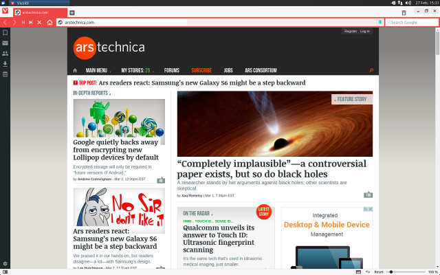
If you’re a former Opera user unhappy with the direction of desktop Opera, we strongly suggest you download Vivaldi. The technical preview release may be rough around the edges, but it already supports tab stacking, adding notes (complete with screenshots of any page), mouse gestures, and tons of keyboard shortcuts. It’s all wrapped in a user interface that’s reminiscent of Opera 12.
It’s no accident that Vivaldi offers most of what Opera 12 offered. Vivaldi’s CEO is Jon S. von Tetzchner, co-founder and former CEO of Opera. Von Tetzchner’s primary goal for Vivaldi is to rebuild the browser that Opera once was—the power user’s browser.
Building a new browser is not for the faint of heart, but of course this isn’t the first time von Tetzchner has done it. Why do it again? The motivations behind Vivaldi are startlingly simple. As Von Tetzchner tells Ars, “Opera abandoned Opera… I thought, what am I going to do now? There were all these features that I was used to, that everyone else was used to and they were gone. So we thought, well there’s a lot of people that want to do more with their browser, let’s make a browser for them.”
In other words Vivaldi isn’t interested in chasing the market share of IE, Firefox, or Chrome. It’s never going to get to that size user base. Instead, it will let you do more with the Web than any of the others will out of the box.
But Vivaldi may also have the potential to re-shape the browser market. Opera never had anything but a tiny slice of the market, but its impact on said market has been enormous. Just about every major feature in today’s browsers started out in Opera: tabbed browsing, mouse gestures, pioneering support for Web standards, and even the clustered page thumbnails when you open a new window or tab (a feature known as “speed dial”). These all started in Opera and were then copied by Firefox, Chrome, Safari, and (sometimes) IE.
<h2>Let's take a tour</h2>
For now Vivaldi is primarily concerned with getting its desktop offering to a stable, usable point.
At first glance, what you see when you open Vivaldi isn’t all that different from any other browser you’ve used. It looks and behaves like the rest on the surface.
Vivaldi, like the latest versions of Opera and seemingly pretty much everything else these days, uses the Blink rendering engine behind the scenes. That means it renders pages just the same as Chrome or any other WebKit/Blink browser would. But Vivaldi’s interface does not rely on the same code you’ll find in Chrome or Opera. In fact, the interface is written entirely with Web technologies, primarily Javascript and CSS. Javascript, React, Node.js, Browserify, and “a long list of NPM modules” create the Vivaldi UI. As the website puts it, “Vivaldi is the Web built with the Web.”
It’s fitting that under the surface Vivaldi is significantly different from its competition since the same is true of its features. Vivaldi’s interface isn’t cluttered; you’ll have to poke around to discover the real power. Once you start to dig in, there’s a ton of stuff you won’t find elsewhere: the ability to put tabs on any side of the screen, customizable keyboard shortcuts, an on/off option for images, even the ability to render a page with monospace fonts if you want. If you remember the heady days back when Netscape was the dominant browser and user stylesheets were still an option, then you’ll love Vivaldi.
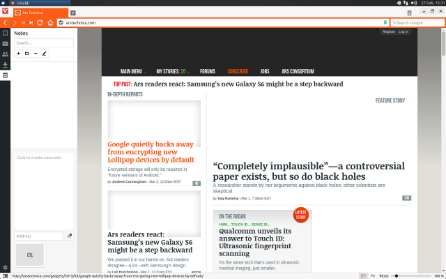
There are plenty of elements you can customize in Vivaldi. The tab bar can be located anywhere, literally any side of the window you like. The address bar can be on the top or bottom. The order in which you cycle through tabs in the tab switcher is customizable, too, as is any keyboard shortcut, the position of the sidebar panel, and the available search engines and keyboard shortcuts for each.
On top of this, there are other power user-friendly tools like what Vivaldi calls “Quick Commands.” Press F2 (that shortcut is configurable naturally) and Vivaldi will launch a small command window which allows you to search through your browsing history, open tabs, bookmarks, and settings. Between the built-in (yes, configurable) keyboard shortcuts and Quick Commands, it’s possible to control Vivaldi and browse the Web without lifting your fingers off the keys. Operating like this, about the only thing that isn’t easy to do is click a link (as far as I can tell you’ll need to tab through every link on the page to get to the one you want).
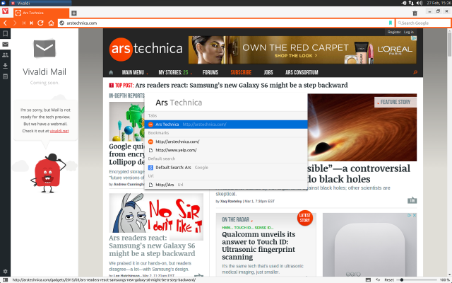
Another familiar feature for Opera refugees is the sidebar, which can show your bookmarks, contacts, downloads, notes, and (not working yet) mail. The notes panel allows you to take notes on a page and even capture screenshots for later reference. Notes can be organized into folders, though currently there doesn’t seem to be a way to export them.
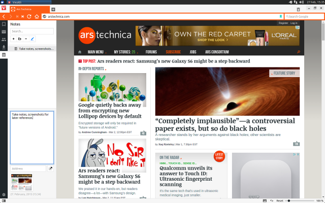
The just-released second technical preview adds a couple more welcome power user features and customization options. There’s now an (optional) bookmarks menu bar. Where most browsers have a special folder for the menu bar, Vivaldi lets you make any folder in your bookmarks show up in the Bookmarks bar.
This second release also sees some improvements to the on-demand image loading. Instead of just on or off, there’s now a setting to show all, only cached images, or no images at all. Although primarily aimed at those on slow or metered networks, turning off images also makes for much faster searching. During testing, we found ourselves turning off images (regrettably, for all the customization there is in Vivaldi, there’s no keyboard shortcut for toggling images) every time we searched on Google or DuckDuckGo. That way, loading those “maybe this page has what I want” results is much faster. (Personally, it also makes visiting Medium.com more tolerable.)
Perhaps the most notable new feature in the second technical preview is what Vivaldi calls “spatial navigation.” Instead of reaching for your mouse, spatial navigation lets you click links by pressing the shift key and the arrow keys. You’ll see a blue highlight surround each link and you can quickly jump to the link you want without taking your hands off the keyboard. In practice, it’s just like tabbing through links, but this method allows you to move much faster since you don’t have to go in order.
The last item of note in the latest version is something we expect to see other browsers copying soon: fast-forward and rewind buttons. Fast forward and rewind take a minute to wrap your head around, but once you do they become fantastically useful, especially rewind. Rewind backs you up to the first page you visited at a particular domain. So if you come to Ars to read this review but then clicked around, read a few other articles, and then want to get back to the Vivaldi download link in this piece, you would just hit rewind. Now you’re instantly back to the first page you started on.
Fast-forward is a little more unpredictable, but it’s still an interesting idea. It attempts to, according to the Vivaldi docs, “jump to the most natural next page” (for example, the second page of search results or the next page in a forum thread).
“Coming soon”
As nice as the new features are, Vivaldi still isn’t feature complete, even by its own standards. Click the mail panel in the sidebar and you’ll get a “coming soon” message.
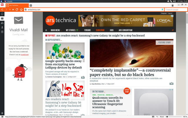
This hints at Vivaldi’s biggest problem right now—it’s not done.
Vivaldi has so many great features, but it can be a little frustrating because it is still very much a technical preview. It’s been largely stable during testing (most of the bugs we encountered using the first release are gone in the second), but it’s still missing some key features.
Extensions still don’t exist. They’re in the works, but for now you’ll have to get by with Vivaldi as is. That means, for example, no Ad-Block Plus or other popular extensions. It’s also worth noting that thanks to extensions you could, in theory, get most of Vivaldi’s features to Firefox or Chrome. This is something von Tetzchner acknowledges, though, as he points out, too many extensions is often the reason browsers get so slow.
Then there’s syncing. In the multi-device world of today, a browser without sync features is next to useless. Thus far, Vivaldi is missing any kind of mobile component, let alone a way to sync between desktop and mobile. Both things are already in the works according to von Tetzchner, though he declined to comment on when either might arrive. “For now, we’re focused on building out the desktop version.”
At the moment, Vivaldi is really too new and unfinished to use on a day-to-day basis, though that hasn’t stopped us from doing so for the past few weeks. It hasn’t always been completely smooth, but it has worked for the most part. Even if you don’t jump in with both feet right now, those who miss the good old Opera—again, we’re talking the Opera of Opera 12—then Vivaldi is something to keep an eye on. Even if you never use it yourself, given their track record, there’s a good chance some of the ideas von Tetzchner and crew come up with may well end up in your favorite browser. Eventually.